2008 NY Times Election Map
I like numbers, no surprise there. Because of this infatuation with large amounts of statistical information displayed in interactive and well designed ways it should also come as no surprise that on election night I sit in front of my monitor and drool.
I like numbers, no surprise there. Because of this infatuation with large amounts of statistical information displayed in interactive and well designed ways it should also come as no surprise that on election night I sit in front of my monitor and drool.
Many of the major news sites offered up some sort of red and blue visualization of who was winning and who was losing. These visualizations ranged from large ticker style numbers displaying electoral votes, pie charts graphs, and culminated in a huge variety of interactive U.S. maps.
I won’t bother listing them all, there is already a great summary over on kottke.org which if you’re into data visualizations at all is worth checking out.
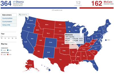
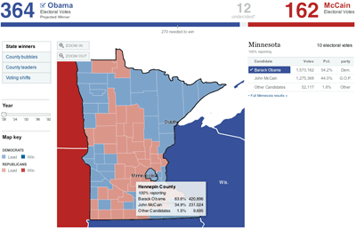
My favorite of the bunch was the flash based interactive map created by the New York Times. I felt they did a really good job of providing enough information to keep us statistics nerds at bay in a manner that was simplistic enough that you could easily get the gist of what was going on without having to work at it. Some of the standout features:
- Ability to click on any state and zoom into a county level
- Inclusion of historical election data so you could compare the last couple of elections to this one
- Simplicity, the interface is well designed and intuitive
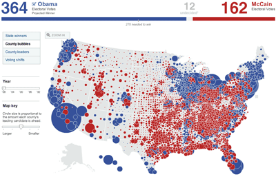
The map includes a “County Bubbles” option, which when toggled switches from your typical red/blue state map to a red or blue circle placed at the center of each county and sized proportional to the number of votes cast. Browsing the map in this view really gives credit to the idea that most urban areas vote democratic. Give it a try, you’ll see what I mean.
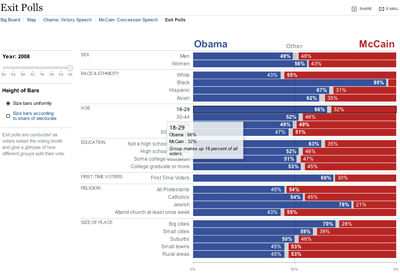
The site also has a bar graph representation of data collected from exit polls going back all the way to 1980, with a bonus check box that resizes the horizontal bars so that their height represents electoral vote proportion and their width represents percentage of that demographic that voted for each party.
Anyone else have favorites?


